Color Works: How Steelcase Translates Palette Inspiration into Purposeful Design
Why Color Matters in the Workplace
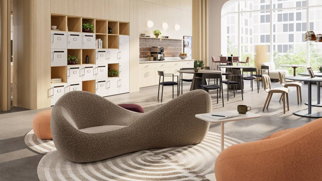
Color isn’t just something we see — it’s something we feel. It shapes mood, sparks creativity, and influences how we work, collaborate, and connect. Steelcase’s Color Works: Palette to Product guide embraces that idea, offering a thoughtful framework for bringing color to life across workplace environments.
From grounding neutrals to expressive pastels, the guide introduces five curated color themes designed to support wellbeing and functionality while still inspiring the senses. Here’s a closer look at how these palettes work and what they bring to modern spaces.
The right color palette can completely transform a space. It can calm, energize, focus, or relax. Steelcase’s approach blends the emotional power of color with intentional material selections — giving designers a clear path from inspiration to application.
Whether the goal is focused productivity or spontaneous interaction, color plays a foundational role in creating environments where people feel good and do their best work.
The Five Color Themes
Grounding Neutrals
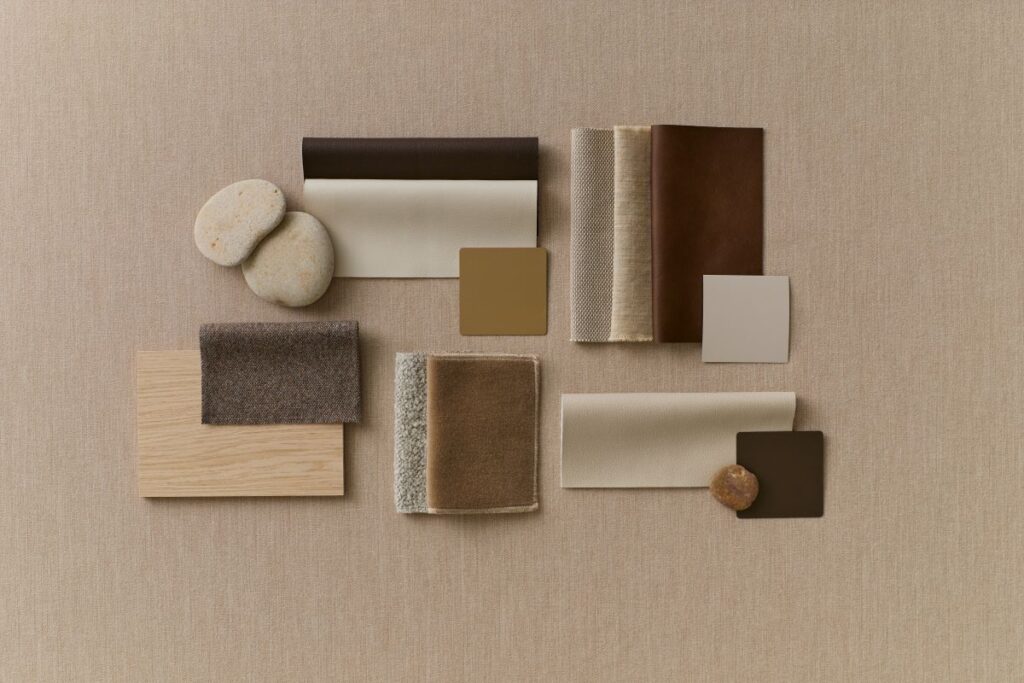
Warm, soft, and deeply comforting, this palette is all about stability. Think natural woodgrains, cozy textures, and tone‑on‑tone layers that create spaces where people instantly feel at ease and give a sense of belonging. This is ideal for focused work zones, welcoming lounges and foundational layers in larger spaces.
Sunbaked Layers
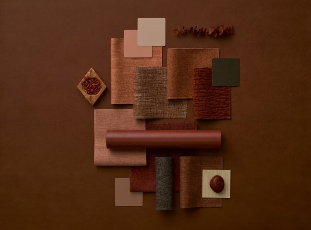
Earthy, tactile, and emotionally rich — this palette brings a quiet warmth that’s both contemporary and timeless. Shades of brown, muted blues, and soft greys create visual depth without overwhelming the senses which can be used in hybrid spaces and environments that benefit from a refined, grounded feel. This palette invites intimacy and comfort while still feeling incredibly polished.
Twilight Tones
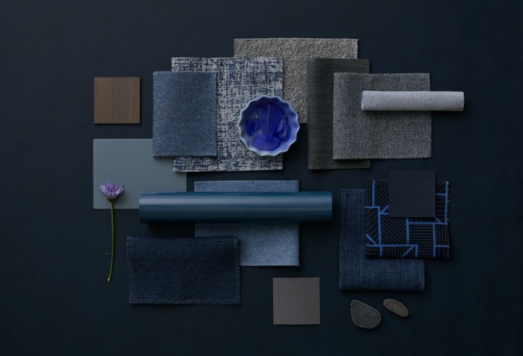
Cool, serene, and minimal, Twilight Tones is a modern palette infused with subtle sophistication. It’s expressive without being loud — perfect for designers who want to introduce calm, clarity, and balance for modern workspaces, nature-inspired designs and rooms that require a soft, contemplative atmosphere.
Rooted in Nature
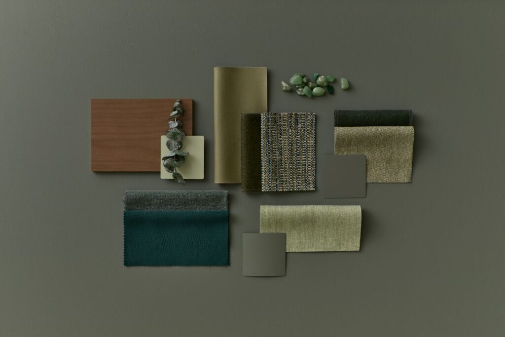
Inspired by lush meadows and organic textures, this palette brings the outdoors in. Its layers of green feel restorative and grounding, tapping into biophilic design principles that support wellbeing. They are used for collaborative areas, retreat zones and spaces blending natural comfort with digital tools. Subtle metallics and warm neutrals help round out the palette, making it versatile as well as beautiful.
Peaceful Energy
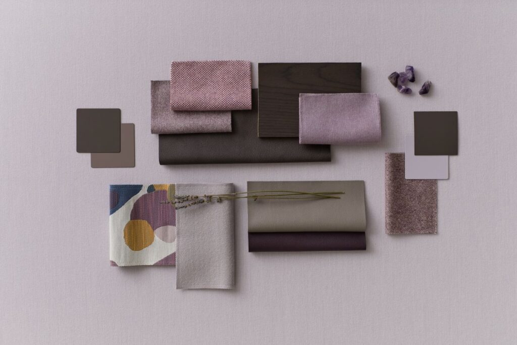
Soft hues meet grounding elements — resulting in a palette that feels imaginative, expressive, and ready to spark creativity. This theme is ideal for creative studios, team collaboration zones and workspaces designed to reduce visual noise. It balances muted tones with a touch of vibrancy, creating an energizing yet soothing atmosphere. Yet supports clarity and focus while promoting ideation and play.
A Framework for Better Workspaces
Ultimately, Steelcase’s approach is about more than finishes. It’s about crafting environments that help people feel grounded, inspired, and connected. Color is an emotional tool — and when used intentionally, it shapes how we show up, collaborate, and thrive.